Tipografia / Typography
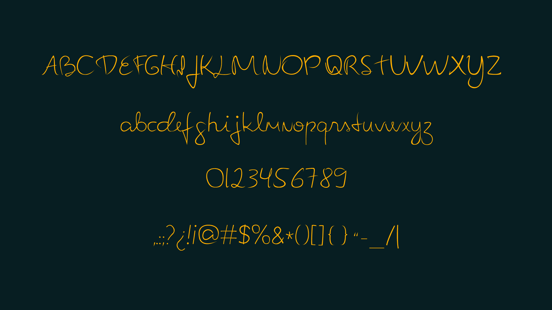
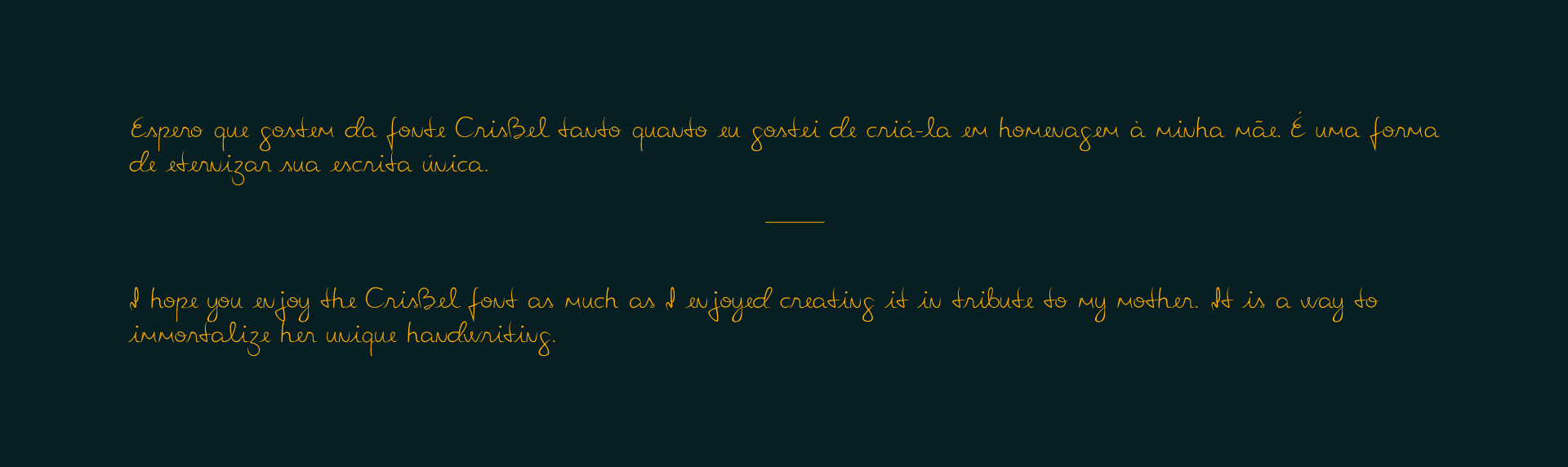
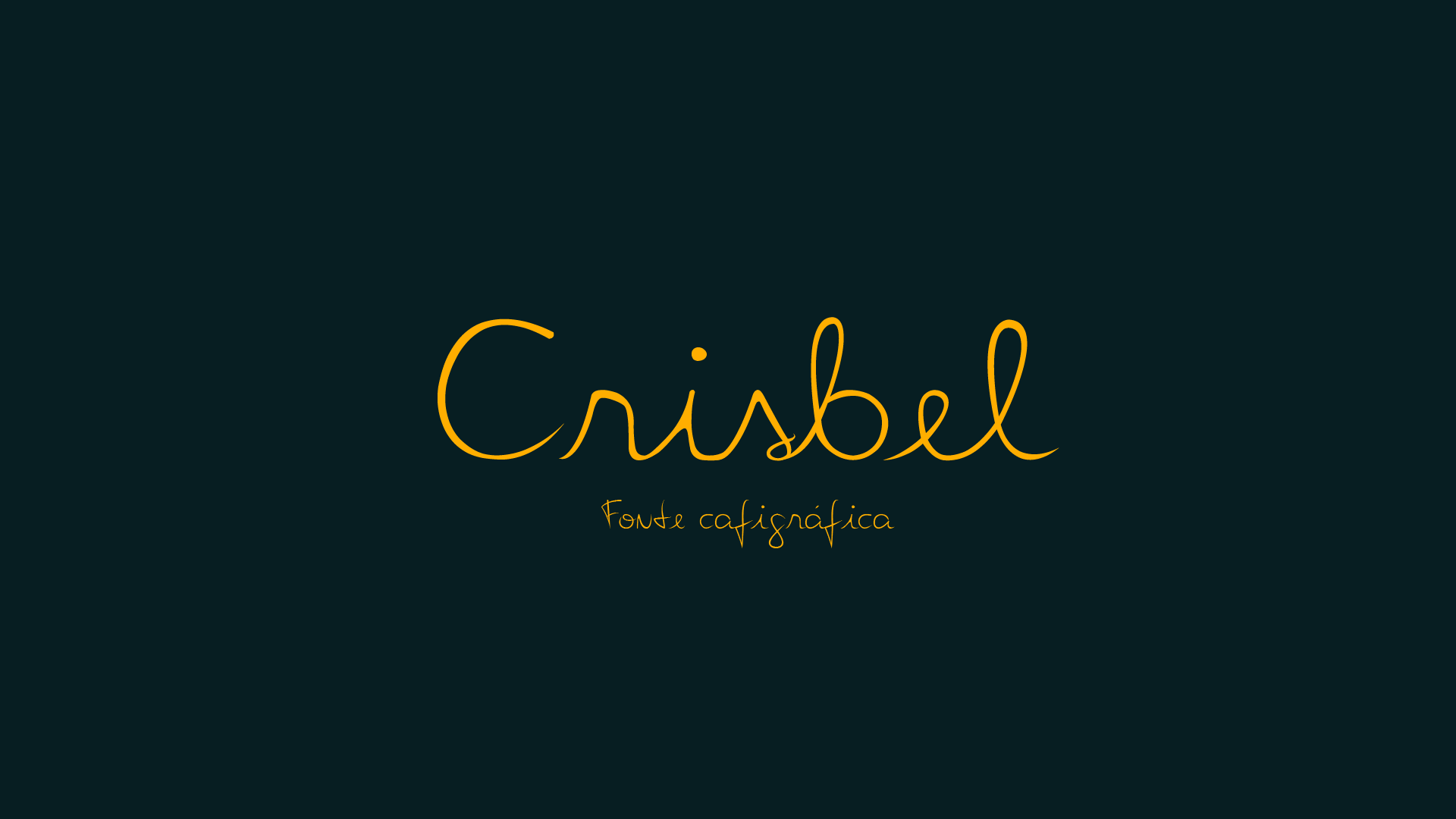
PT | A fonte Crisbel é uma homenagem à minha mãe, Isabel Cristina. A ideia foi preservar sua escrita original o máximo possível. Como se trata de uma letra manuscrita, há variações nas extremidades, como nos traçados de uma caneta.
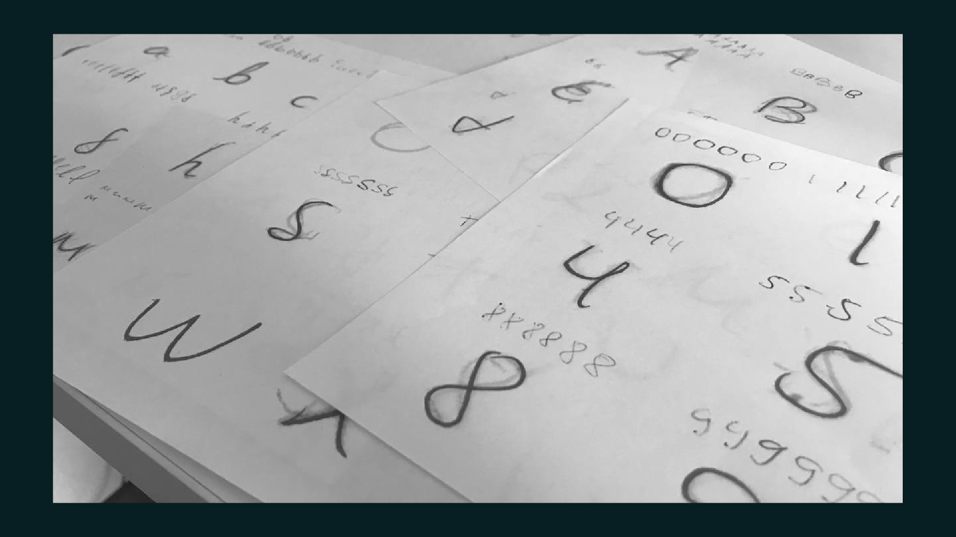
Para desenvolver a fonte, comecei analisando várias referências, incluindo anotações e cartas antigas. Scaneei todas as palavras disponíveis e separei letra por letra, sobrepondo camadas e desenhando por cima para entender melhor os traços mais evidentes. Assim, consegui identificar características únicas de cada caractere.
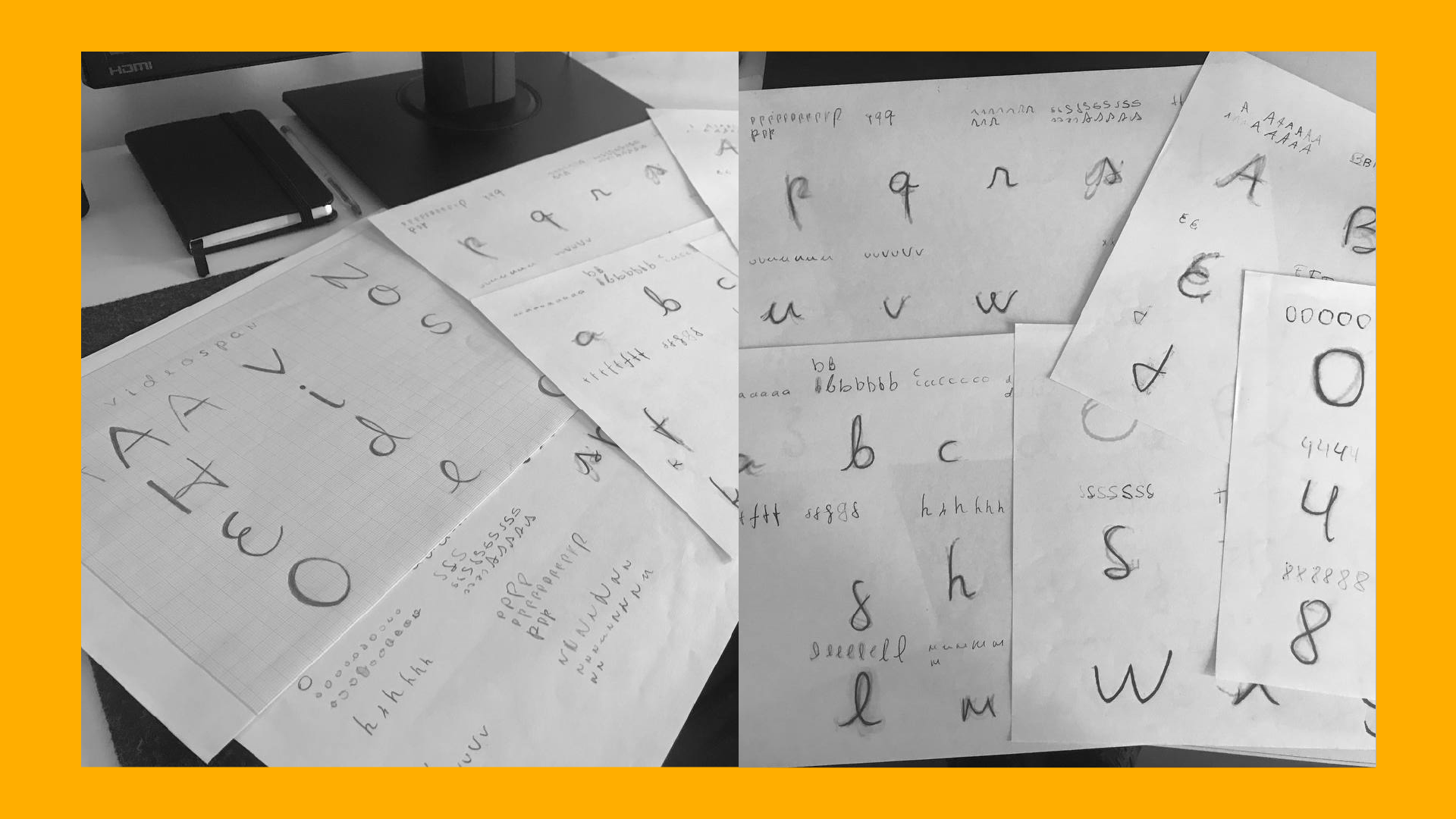
Ao longo do processo, foram utilizados diversos exemplos de cada letra para chegar a um resultado que destacasse as características específicas de cada uma. O espaçamento também foi adaptado para manter algumas letras mais próximas e outras mais distantes.
Para desenvolver a fonte, comecei analisando várias referências, incluindo anotações e cartas antigas. Scaneei todas as palavras disponíveis e separei letra por letra, sobrepondo camadas e desenhando por cima para entender melhor os traços mais evidentes. Assim, consegui identificar características únicas de cada caractere.
Ao longo do processo, foram utilizados diversos exemplos de cada letra para chegar a um resultado que destacasse as características específicas de cada uma. O espaçamento também foi adaptado para manter algumas letras mais próximas e outras mais distantes.
EN | Crisbel font is a tribute to my mother, Isabel Cristina. The idea was to preserve her original handwriting as much as possible. As it is a handwritten font, there are variations in the edges, such as in pen strokes.
To develop the font, I started by analyzing several references, including old notes and letters. I scanned all available words and separated each letter, overlapping layers and drawing on top to better understand the most evident traits. This way, I was able to identify unique characteristics of each character.
Throughout the process, several examples of each letter were used to achieve a result that highlighted the specific characteristics of each one. The spacing was also adapted to keep some letters closer and others farther apart.